🎨 Today's Design Task
Today, I focused on redesigning the registration process for Seedlang, a language-learning app. The current design isn't very accessible, so my goal was to make it smoother, more engaging, and user-friendly!
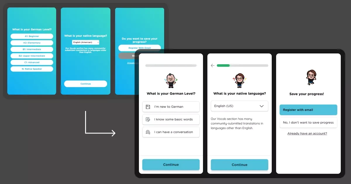
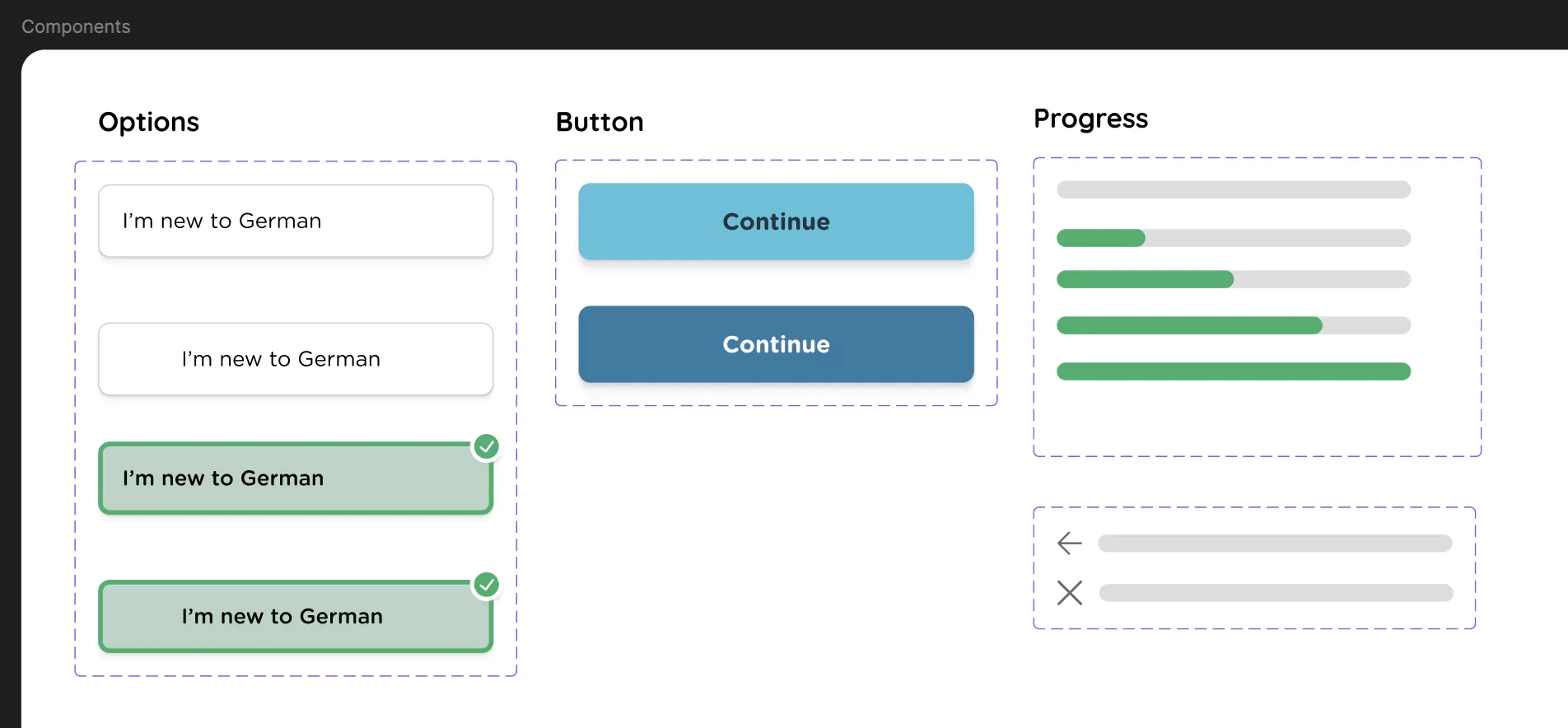
🖼️ The Final Design
This task took me the entire day, and I felt a bit slow at times, but I’m reminding myself to be patient. I used Cari and Janusz—characters familiar to many who find Seedlang through Easy German—as the main faces of the app to make the experience more inviting.
🚀 My Design Process
-
Research: I started by researching how other apps guide users through the sign-up process.
-
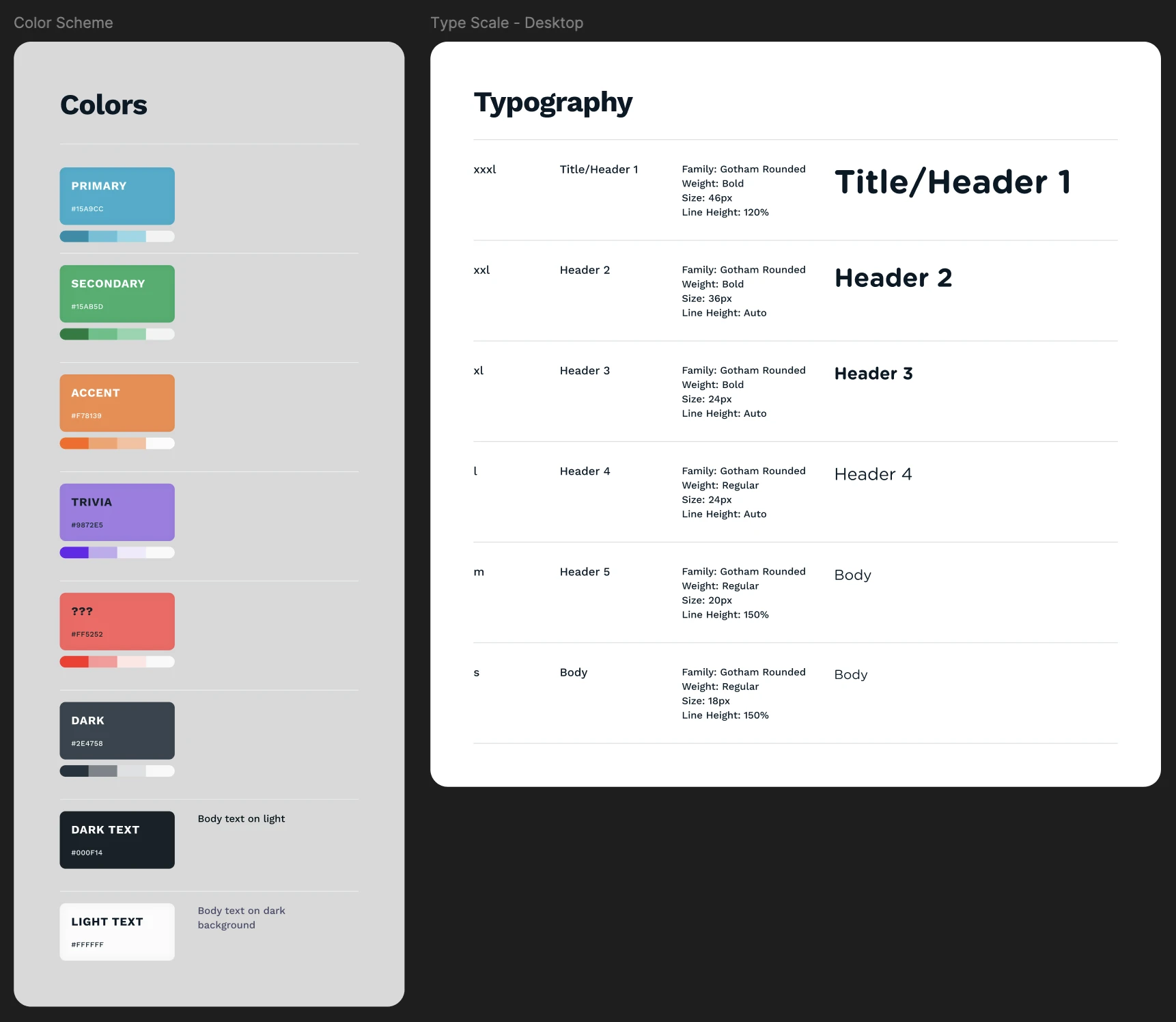
Style Guide Creation: I created a style guide based on Seedlang’s existing design elements.
-
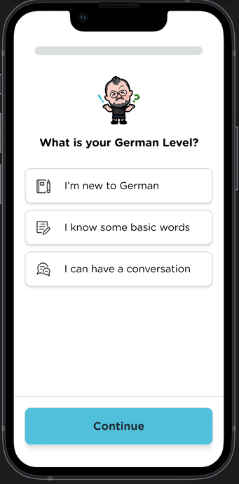
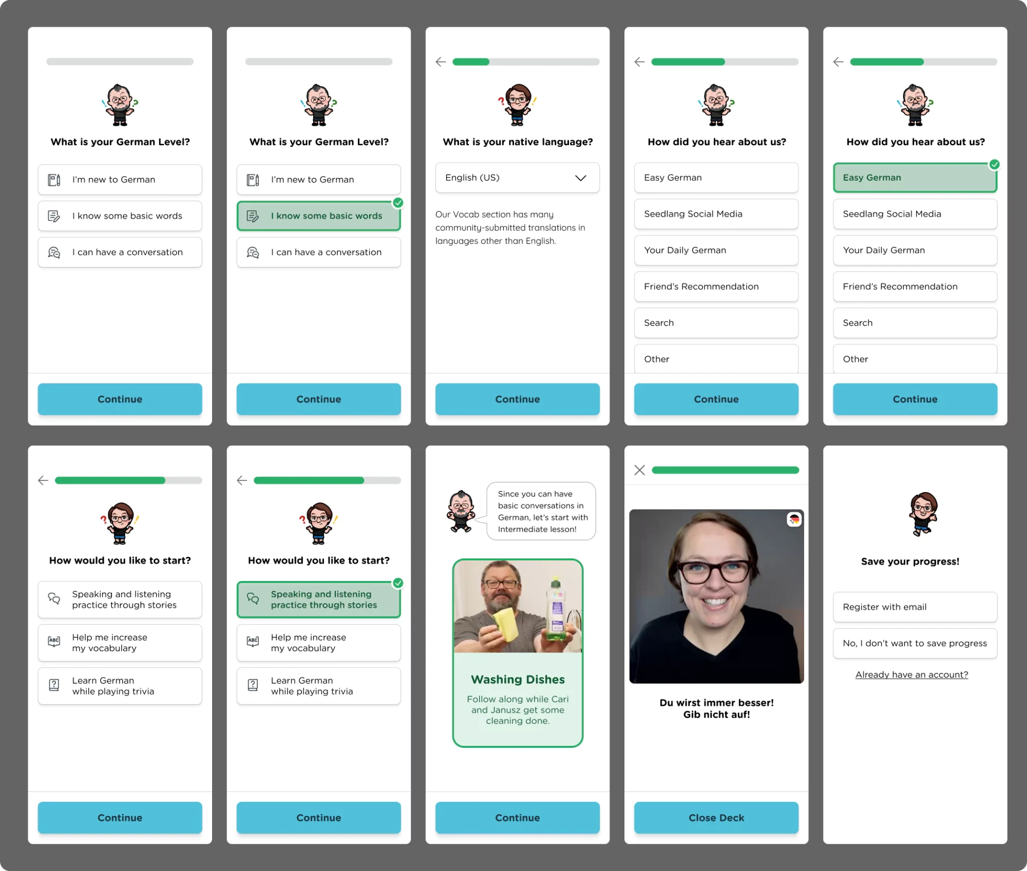
Component Design: I built components for options, buttons, and the progress bar.
-
Character Integration: I incorporated cute images of Cari and Janusz from Seedlang to add a familiar touch.
-
Sign-up Flow Adjustment: I placed the email registration screen after the first lesson to prioritise user experience.
-
Prototyping: I added interactive elements, allowing users to navigate forward, go back, and select options easily.
-
Animations: I added animations to some of the images to make the process more dynamic.
-
Feedback and Adjustments: Based on feedback from my partner, I made these tweaks:
- Adjusted the image animation to align the expanded version at the bottom with the smaller version.
- Modified the image sequence to small -> expanded -> small for a smoother flow.
- Simplified screen transitions to keep the progress bar stationary, with only the green progress area moving.
🧠 Challenges and Solutions
- I felt discouraged by how long the process took, but I pushed through and completed it.
- The primary colours of Seedlang (light blue and green) didn’t contrast well against black or white texts, so I adjusted them by making the shades lighter and darker, though I’m still not entirely satisfied.
💡 What I Learned Today
I’ve realised I enjoy designing for desktops more than mobiles, probably because I’m faster at it. However, I need to be patient with my learning curve—it’s only been a month since I started taking this seriously!
⏰ If I Had More Time
- I’d explore different colour combinations to find a more visually appealing palette.
- I’d experiment with Figma prototypes to refine how the progress bar remains static while other elements move.
💌 Any Thoughts?
What are you working on these days? I’d love to hear your feedback on my design or any tips you might have!
Thanks for following along on Day 29 of my challenge. Tomorrow’s the big finale—see you on Day 30!
With love and light 🫶🏻
Yoshie
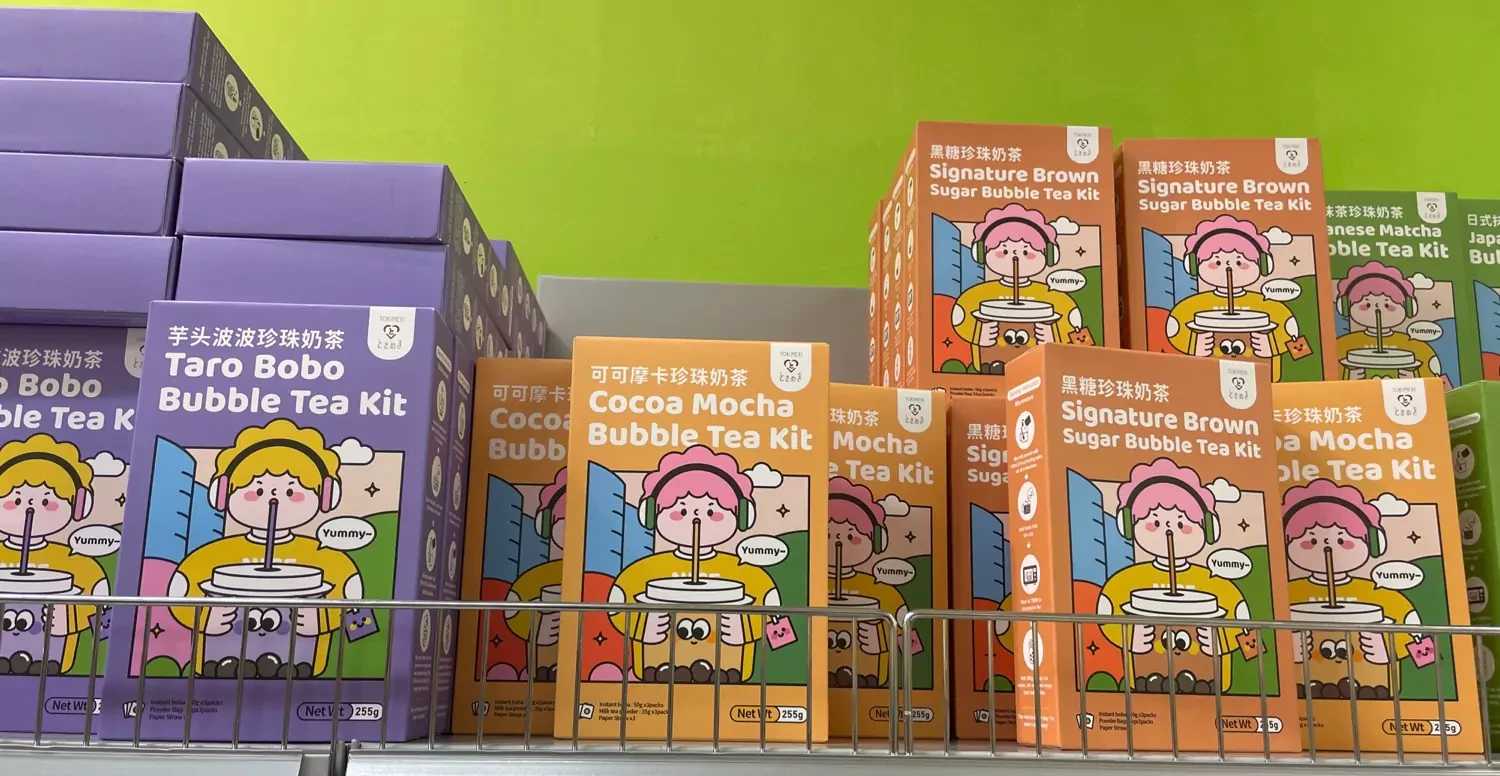
P.S. We visited an Asian supermarket yesterday, and I found some super cute designs that inspired me! I’d love to try creating similar art, and I’m dreaming of one day having a HUGE bubble tea like a person has in the design! 😂