👩🏻🔬 Accessibility Insights from My Review
While reviewing Droople’s website, I identified 23 accessibility and UI/UX issues on the homepage. Of these, 10 could be fixed with design changes, 12 required programming fixes, and 1 involved content editing.
Let’s explore how I approached these issues and improved the design!
✅ How I Solved Accessibility and UX Issues
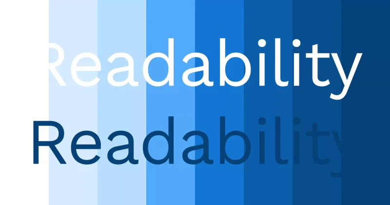
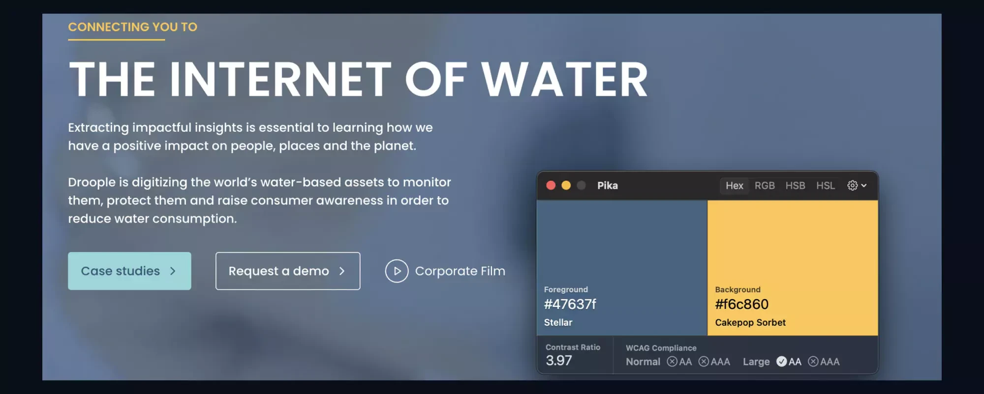
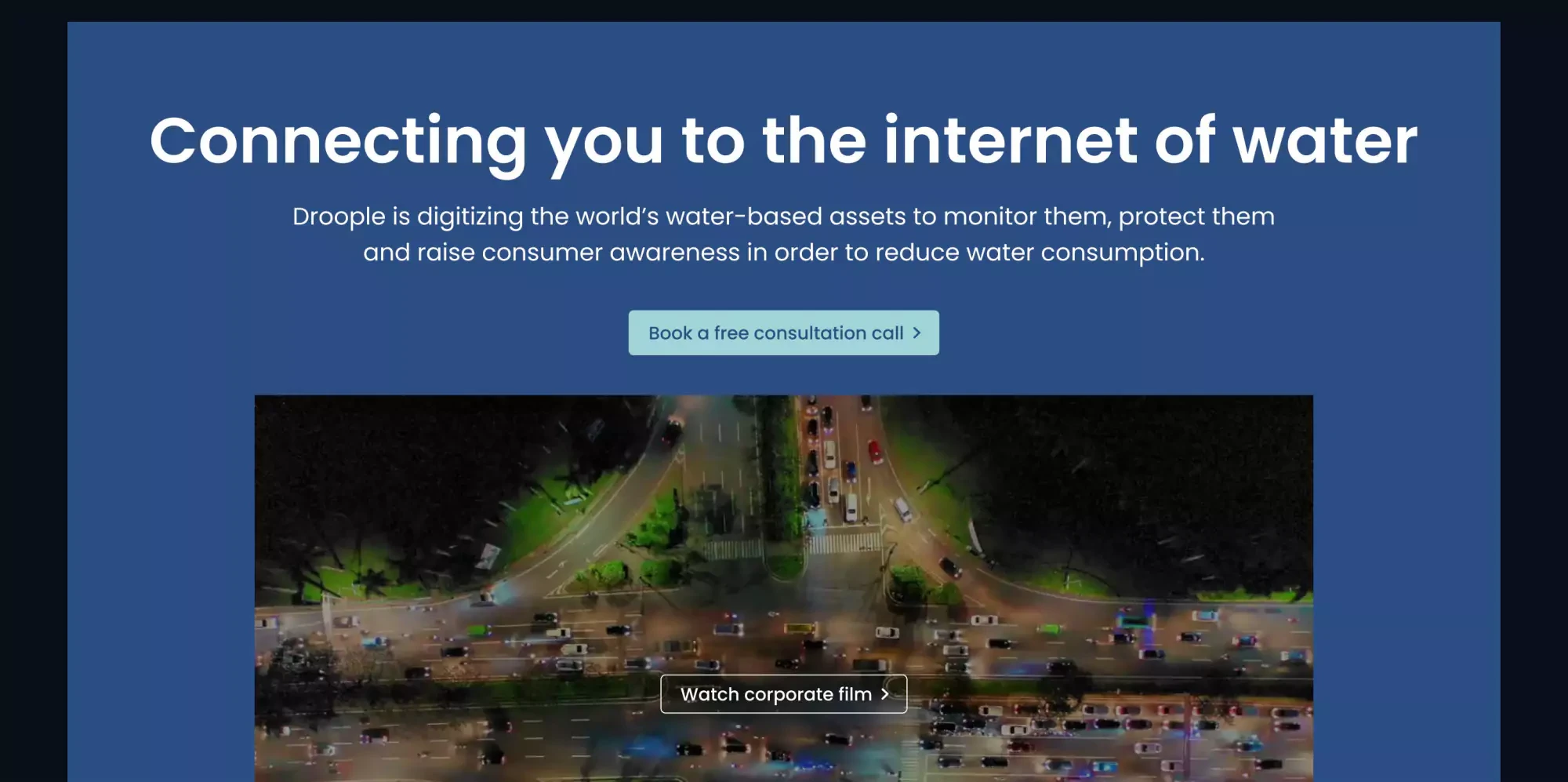
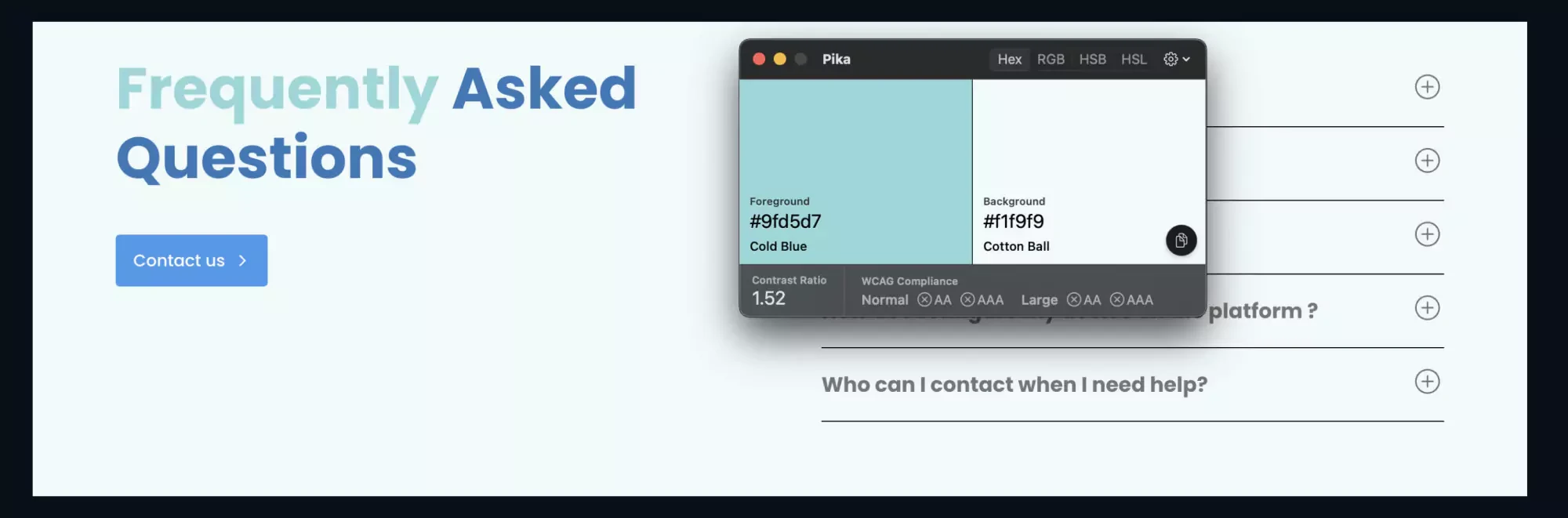
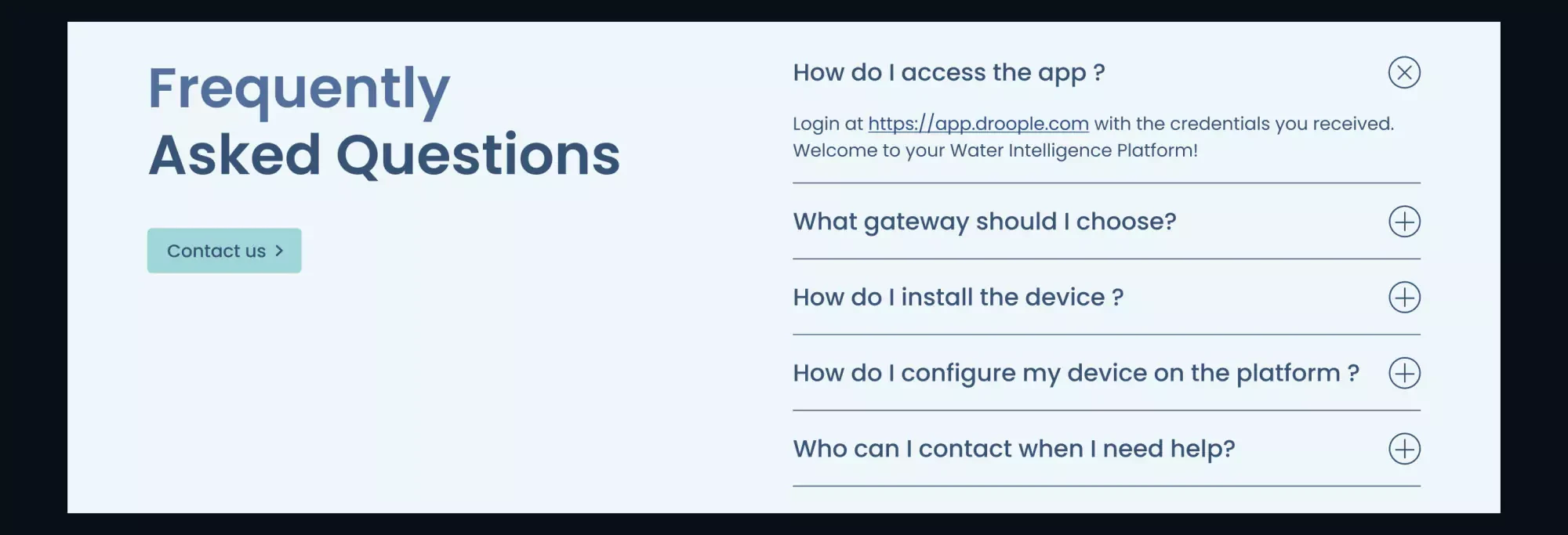
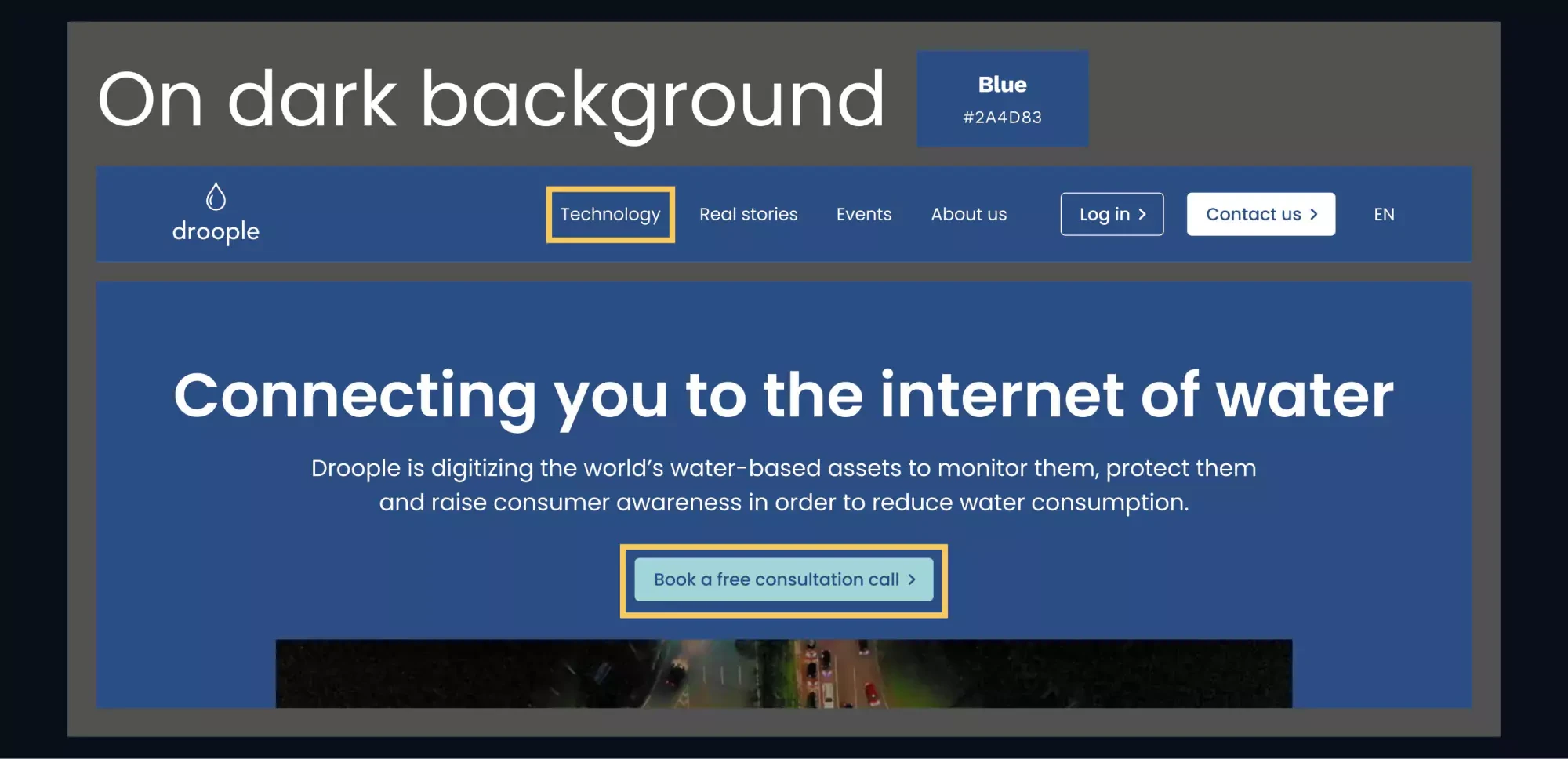
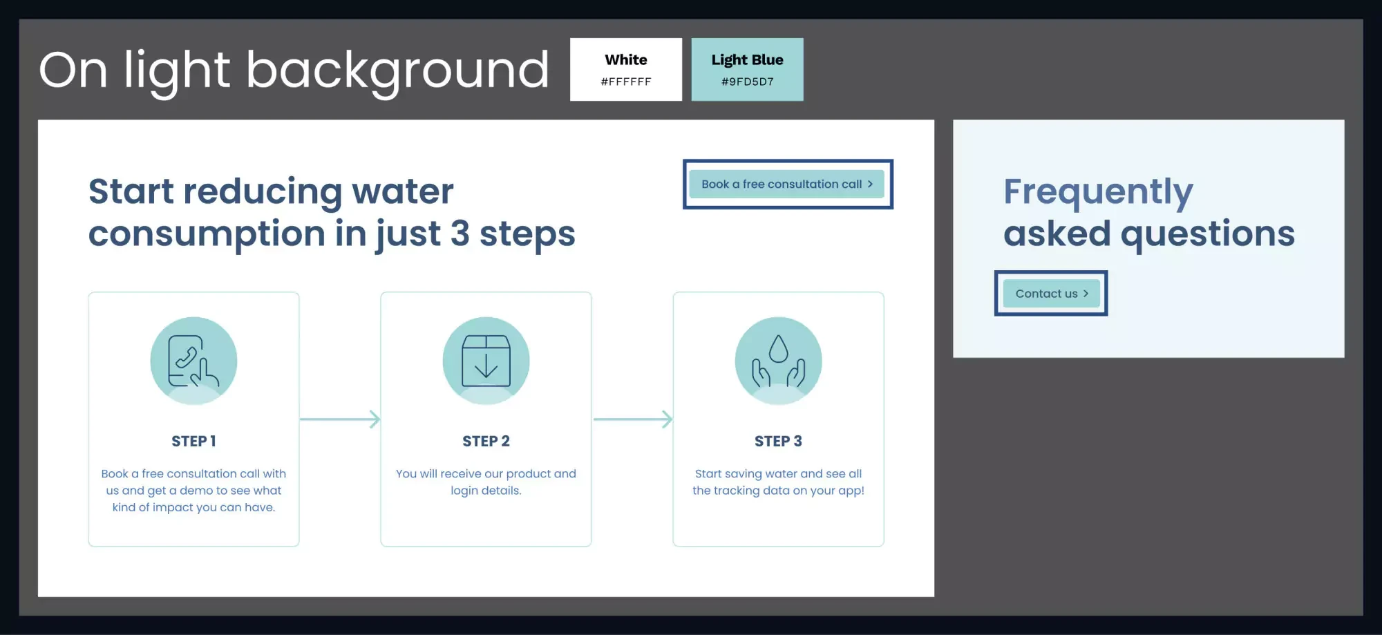
1. Colour Contrast
Many text elements didn’t have enough contrast against their background, making them hard to read for users with visual impairments. I ensured all text met the WCAG requirement of at least a 4.5:1 contrast ratio. (Learn more about colour contrast here.)
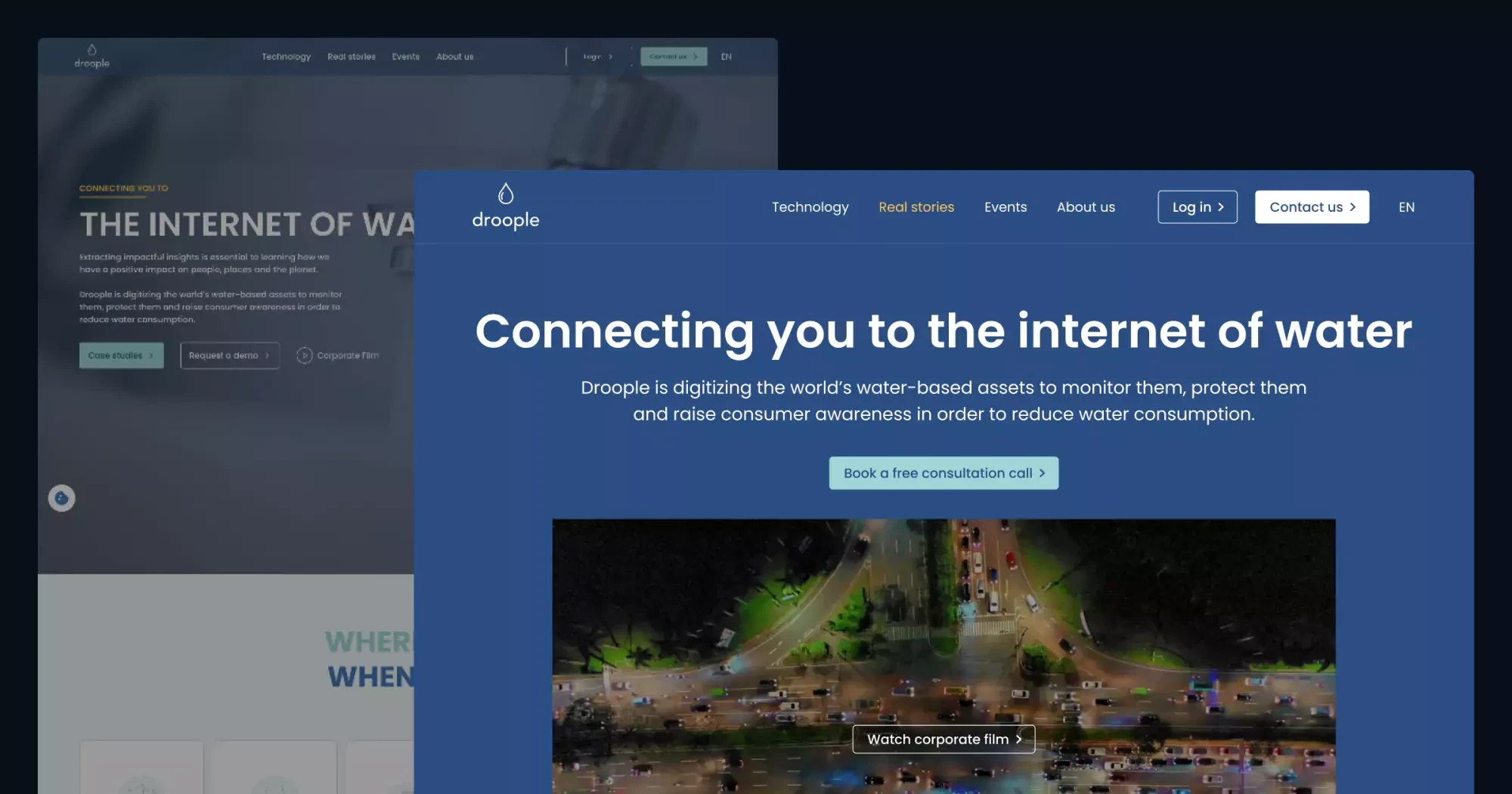
The current hero section:
Yoshie's redesign of the hero section:
The current FAQ section:
Yoshie's redesign of the FAQ section:
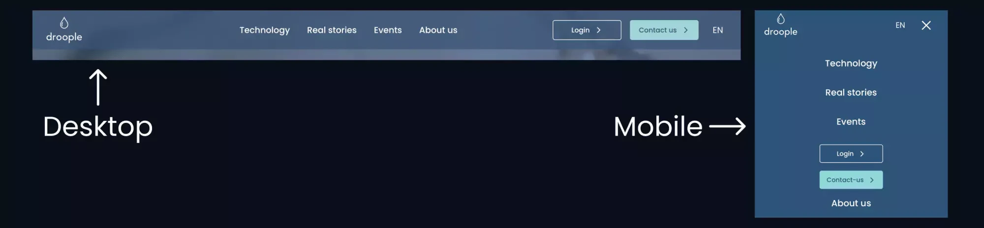
2. Mobile Navigation Menu Changes Order:
The navigation menu items change order on mobile, causing inconsistency across devices. I didn’t redesign the mobile version, but I would recommend keeping the same order across all devices to avoid confusing users.
The current website's navigation on desktop and mobile:
3. Non-descriptive Buttons:
Some buttons lacked clarity in their text.
- For the “Discover” button, I would change it to something more descriptive, like “Learn how our product works” or “Learn more about our product.”
- The “View stories” and “Case studies” buttons both led to the same page. I would rename them consistently as “Read real stories” to avoid confusion.
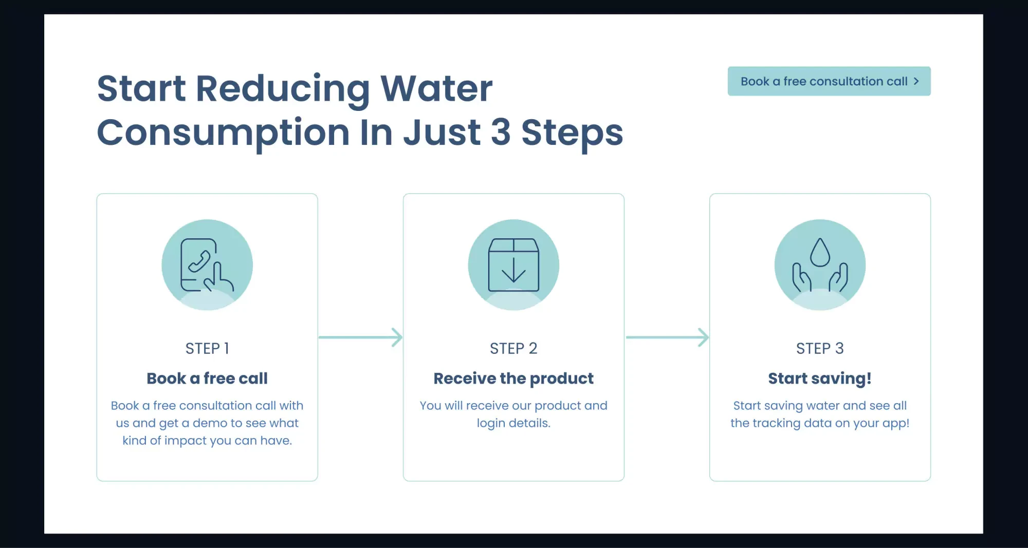
4. Content Clarity:
It wasn’t immediately clear what Droople does or how it can help users. I added a 3-step section with a clear CTA to guide users toward understanding Droople’s services and taking action.
Yoshie's design of the 3-step section:
5. Inconsistent Spacing on Mobile:
I’d use a standardised spacing system to ensure elements are evenly spaced on mobile devices.
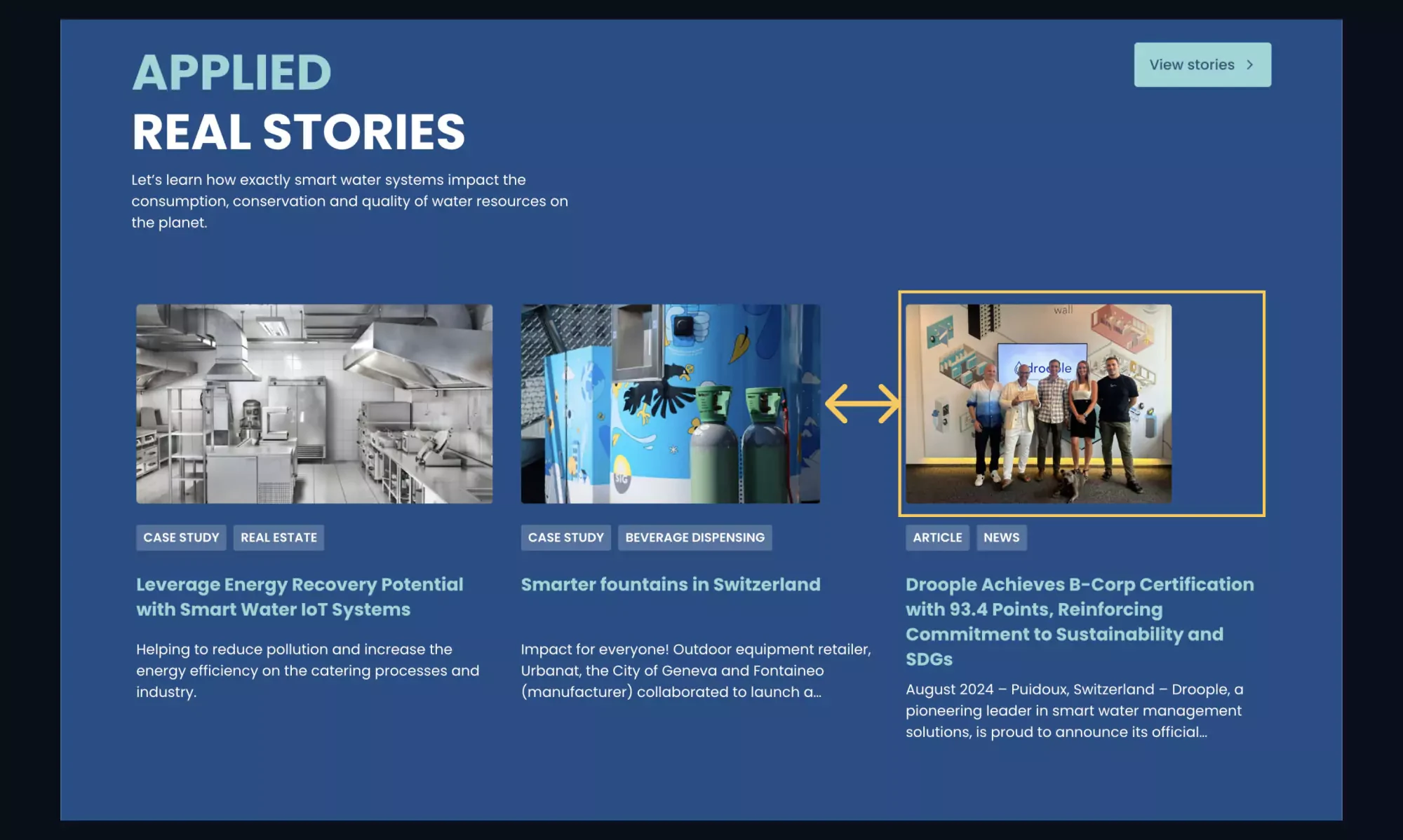
6. Duplicate Links in Case Study Cards:
The image and title in the case study cards were clickable, creating redundancy. It is less confusing and more practical, especially for screen readers and keyboard navigation users, to make the whole article clickable and focusable.
The current website's case study section:
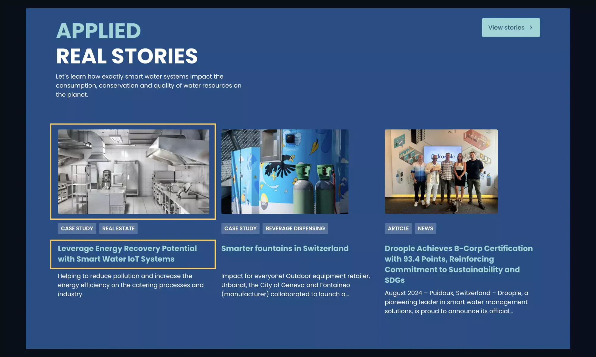
7. Image Size and Spacing:
The last image in the APPLIED REAL STORIES section didn’t display at full width, and the spacing between cards is not consistent, which is disrupting the visual layout. I adjusted the image to fill the space and ensured consistent spacing between all cards.
The current website's case study section:
8. Focus Indicator Visibility:
Some elements either lacked focus indicators or had indicators that were too faint. I designed custom focus outlines that were more visible across different backgrounds, improving keyboard navigation for users.
Yoshie's design of focus indicators for a dark background:
Yoshie's design of focus indicators for a light background
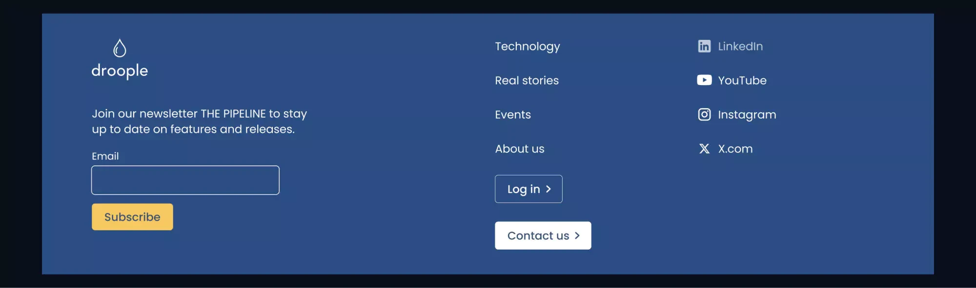
9. Email Input Lacking a Label:
The email input field didn’t have a visible label, making it unclear for all users. I would add a simple label, like “Email,” to improve clarity and accessibility.
Yoshie's redesign of the footer:
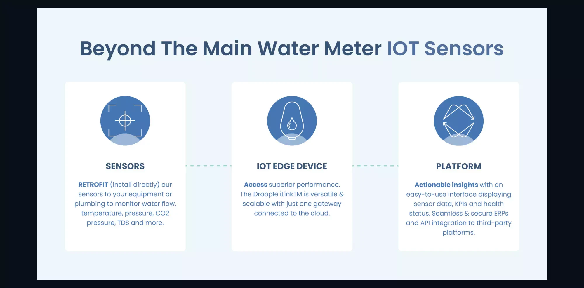
10. Incorrect Reading Order in “Beyond the Main Water Meter IOT Sensors” Section:
When navigating this section with a screen reader, the content was read in the wrong order—titles first, then content. I grouped each title and its content visually and structurally, so they are read in the correct sequence.
The current website's Beyond the Main Water Meter IOT Sensors section:
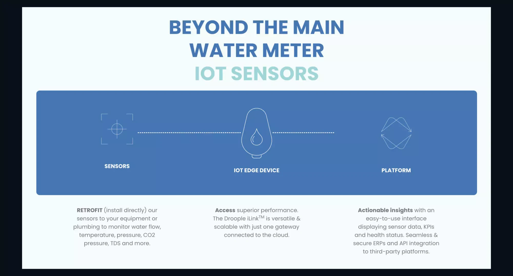
Yoshie's redesign of the Beyond the Main Water Meter IOT Sensors section:
👩🏻💻 Programming Fixes for Accessibility
Alongside design changes, several issues required coding adjustments to ensure full accessibility:
1. Button, Link, and Menu Elements Lack Accessible Names:
Interactive elements like buttons and menu items didn’t have accessible names, which made it hard for screen readers to describe their purpose. Adding aria-label or aria-labelledby attributes to these elements would allow screen readers to provide meaningful context.
2. Keyboard Navigation for Sliders (AWARDS & RECOGNITIONS Section):
Keyboard users couldn’t navigate the sliders in this section, except for the first card (B-Corp). I would assign tabindex="0" to each slider card, ensuring that users can access all the cards via keyboard. The slider arrows should also be made keyboard accessible.
3. No "Skip to Content" Link:
Without a “Skip to Content” link, keyboard users must navigate through the entire header before reaching the main content. Adding this link would enhance the user experience by allowing them to jump directly to the primary content.
4. Broken Cookie Popup Interaction:
The cookie pop-up wasn’t fully functional with keyboard navigation, and buttons to close it weren’t working properly. I would ensure that keyboard focus moves through all elements and that the “close” and “confirm” buttons work as expected.
5. Missing Focus Indicators:
Some interactive elements, like toggle buttons and slider arrows, lacked focus outlines. Adding clear focus indicators would help users easily identify where they are on the page when using keyboard navigation.
6. Misuse of ARIA Landmarks:
Several ARIA landmarks were incorrectly applied, with multiple banners used. I would correct this by using semantic HTML elements, such as <header>, <main>, and <footer>, to provide proper structure for screen readers.
7. Text Hidden for Screen Readers (Wherever, Whenever Section):
The text in this section is only revealed by hovering, making it invisible to screen reader users. I would make the text permanently visible to ensure accessibility.
8. Inconsistent Tab Order (Contact/Subscribe Buttons in Footer):
The tab order in the footer was illogical, with the contact button being focused before the email input field. I would adjust the tab order so that the subscribe button follows directly after the input field.
9. FAQ Toggle Focus Issues:
In the FAQ section, keyboard users were unable to focus on the toggles, and focus jumped to hidden links within each FAQ. I would convert the questions into buttons to provide better control and focus management.
10. Slider Issues on Smaller Screens or Zoom:
The slider in the AWARDS & RECOGNITIONS section stopped working when zoomed in or on narrow screens. I would ensure that the slider remains functional and that the arrow buttons are visible on all screen sizes.
11. Brands Slider Not Working on Mobile:
The automatic slider wasn’t working on mobile, causing brands to be stuck. I would display all brands without sliding for better mobile usability.
12. Lack of Pause for Automatic Sliders:
Sliders moved automatically without a pause button, making it hard for users to interact with the content. I would add a pause button or make all the elements visible without sliding.
✍️ Content Editing Fix for Accessibility
GIF and Image Elements Lack Alt Text
Most of the images have meaningful alt text, which is great! But GIF doesn’t have alt text, and 2 different images on the footer have the same alt text. Add meaningful alt attributes to all image elements.
📝 What I Learned
The Lighthouse test gave Droople’s site a 90% accessibility score, so I wasn’t expecting too many issues. But through this detailed review, I found more issues than I expected (as always 🥹).
➡️ What's Next?
I just published the first article in my series, "I Read the Web Content Accessibility Guidelines (WCAG) 2.2 So You Don’t Have To!" 🌈
This series is designed to help designers and developers create accessible websites and apps, and it can even be shared with business owners or managers to demonstrate that making websites and apps accessible is not a cost; it is a valuable investment ✨
Let’s connect on Mastodon 🐘💚 — I’d love to hear your feedback. Did I miss anything? What would you improve in my redesign?
Have an awesome day! 🥰