UI/UX
10 Questions to Ask Before Calling Your Design Complete
Are you a designer, developer, or content creator working on websites or applications? These 10 questions cover the fundamental accessibility considerations every design needs to address. If you can answer "yes" to all of them, you've got the basics covered. While there are many more questions to ask in creating accessible design (which I'll cover in future articles), these essentials will set a …
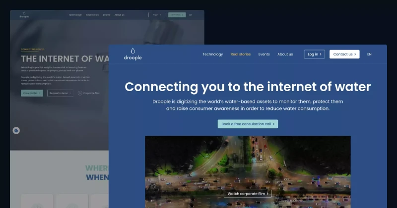
Improving Accessibility & UX on Droople’s Website! 💧
👩🏻🔬 Accessibility Insights from My Review While reviewing Droople’s website, I identified 23 accessibility and UI/UX issues on the homepage. Of these, 10 could be fixed with design changes, 12 required programming fixes, and 1 involved content editing. Let’s explore how I approached these issues and improved the design! ✅ How I Solved Accessibility and UX Issues 1. Colour Contrast Many text …
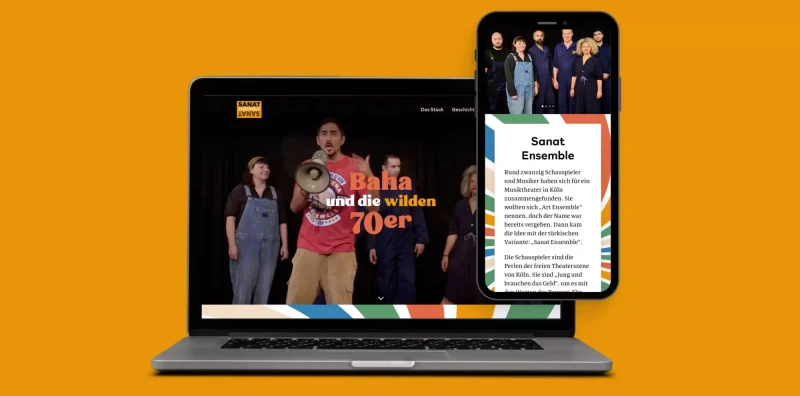
Finding Balance Between Fun, Joy, and Seriousness
Designing the Sanat Ensemble website was both a rewarding and challenging experience. The task was to capture the vibrant energy of the 70s whilst honouring Turkish people and other communities who fought for equal rights. I also wanted the design to reflect the joy and lively spirit of their music and performances. Here’s a breakdown of the key struggles I encountered and how I overcame them! 1. …
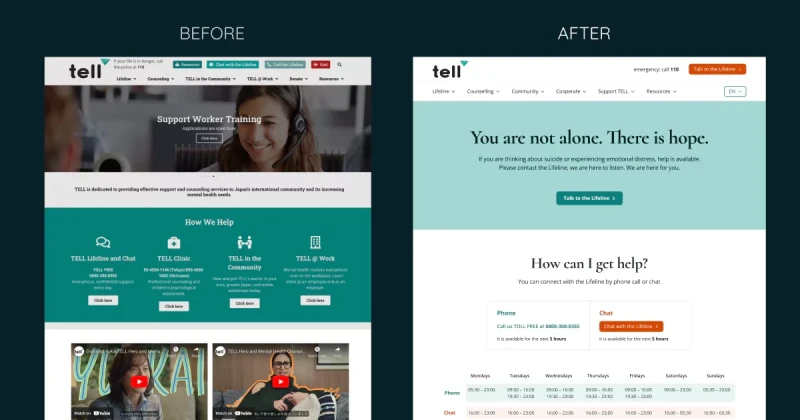
Making TELL Japan Website Accessible and Decluttered 🧹
👩🏻🔬 Accessibility Testing Insights During my review of the TELL Japan website, I identified 17 accessibility and UI/UX issues. While 7 of these issues required coding changes, I addressed the other 10 through design improvements. Here's how I tackled them. ✅ How I Solved Accessibility and UX Issues 1. Low Colour Contrast on Buttons and Text: I improved the colour contrast of text and essential …