Accessibility
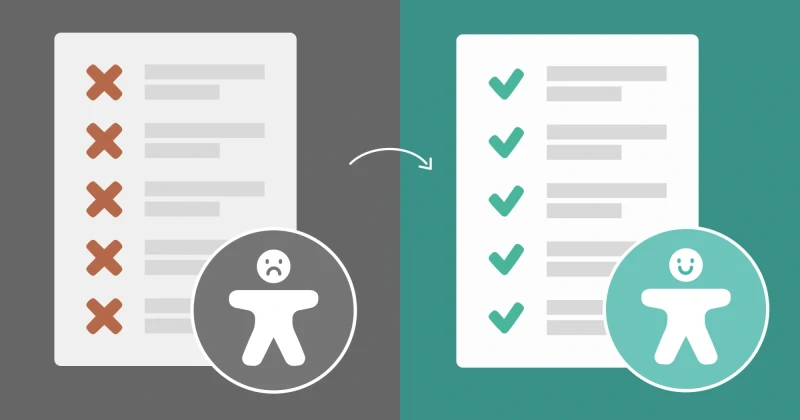
10 Questions to Ask Before Calling Your Design Complete
Are you a designer, developer, or content creator working on websites or applications? These 10 questions cover the fundamental accessibility considerations every design needs to address. If you can answer "yes" to all of them, you've got the basics covered. While there are many more questions to ask in creating accessible design (which I'll cover in future articles), these essentials will set a …
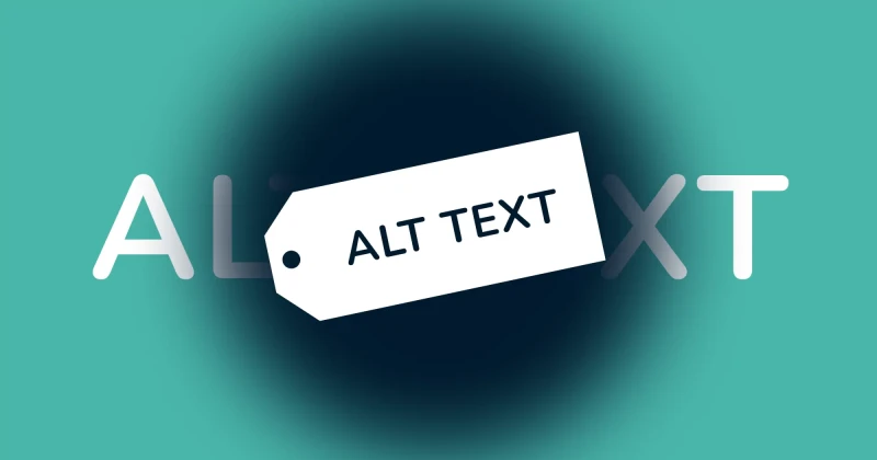
How Alt Text Makes Your Website Better for Everyone
“Alt text is just the text that shows up when an image doesn’t load, right?” That's what I thought when I was a software engineer. Sometimes I’d throw in a file name as alt text, and other times I’d skip it entirely. What I didn’t realise back then was that alt text is not optional, it’s essential. By the end of this article, you’ll know why alt text is so important, how to write it effectively, …
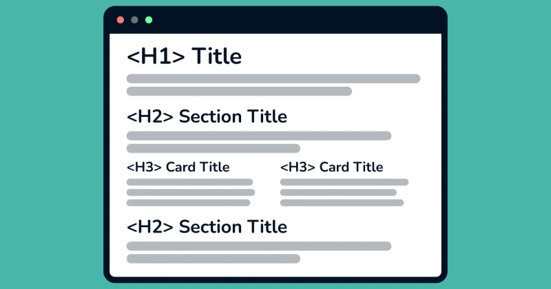
Is your website easy to navigate? How to properly structure your website 🛠️
What are headings? Aren’t they just big, bold titles? That’s what I used to think, too. But headings are much more than that. Headings are hierarchical elements that indicate the importance and relationship between different sections of content. They are essential for both sighted and visually impaired users. Why having a proper heading structure matters 🤔 Sighted users understand website …
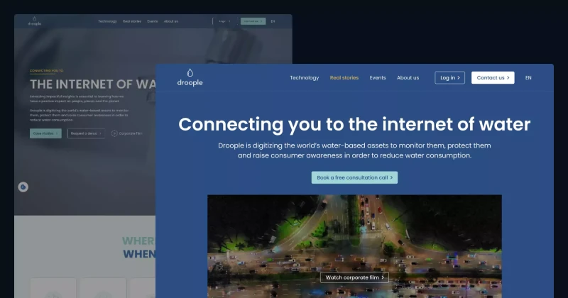
Improving Accessibility & UX on Droople’s Website! 💧
👩🏻🔬 Accessibility Insights from My Review While reviewing Droople’s website, I identified 23 accessibility and UI/UX issues on the homepage. Of these, 10 could be fixed with design changes, 12 required programming fixes, and 1 involved content editing. Let’s explore how I approached these issues and improved the design! ✅ How I Solved Accessibility and UX Issues 1. Colour Contrast Many text …
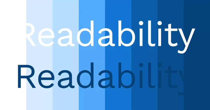
Make Your Website Easy to Read for Everyone (Why Colour Contrast Matters)
Have you ever used white text on a pastel background because it looked cute? You’re not alone—I’ve done it too 🥹 By the end of this blog, you’ll understand why that is a bad idea and how to maintain a beautiful, on-brand design without compromising accessibility. Why Low Contrast is a Problem For people with low vision or colour blindness, low-contrast text can be nearly impossible to read. The …
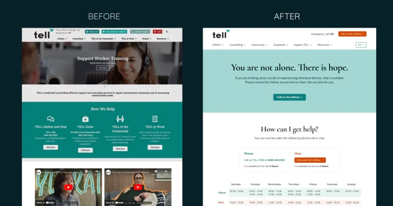
Making TELL Japan Website Accessible and Decluttered 🧹
👩🏻🔬 Accessibility Testing Insights During my review of the TELL Japan website, I identified 17 accessibility and UI/UX issues. While 7 of these issues required coding changes, I addressed the other 10 through design improvements. Here's how I tackled them. ✅ How I Solved Accessibility and UX Issues 1. Low Colour Contrast on Buttons and Text: I improved the colour contrast of text and essential …