Articles
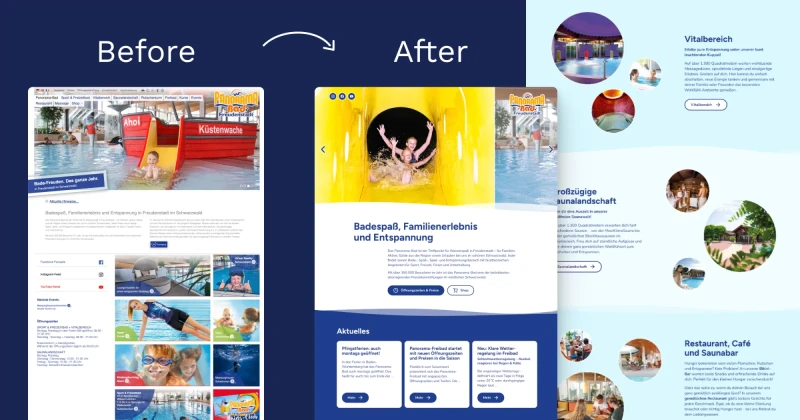
Case Study: Designing Accessible Website for Panorama-Bad
Introduction I am thrilled to announce that the new website for Panorama-Bad Freudenstadt went live last Friday! 🎉 Check it out here. Identifying the Challenge When I first received the initial design for the Panorama-Bad website, I saw that it had some good ideas. However, it needed more structure and a focus on development. The challenge was to create a site that not only showcased the vibrant …
10 Questions to Ask Before Calling Your Design Complete
Are you a designer, developer, or content creator working on websites or applications? These 10 questions cover the fundamental accessibility considerations every design needs to address. If you can answer "yes" to all of them, you've got the basics covered. While there are many more questions to ask in creating accessible design (which I'll cover in future articles), these essentials will set a …
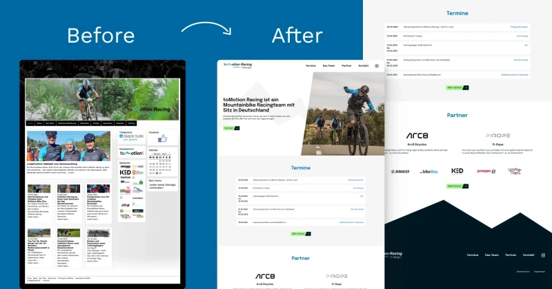
A Case Study: toMotion Racing Website Redesign
Project Overview As a designer and accessibility auditor, I undertook the redesign of toMotion Racing's website. This case study outlines my design process and key decisions that shaped the final product. You can visit the website from here. Client Brief The project began with a clear foundation: toMotion Racing needed a simple website structure and had a clear vision for their new design …
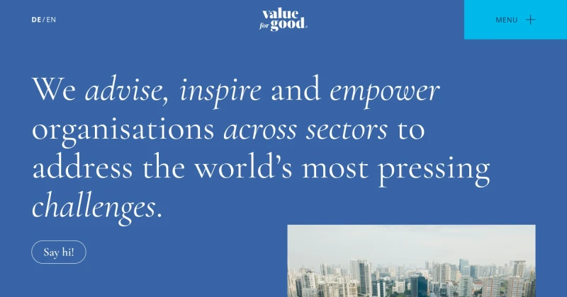
A Case Study: Development-Ready and Accessible Design for Value for Good
The Journey I had the opportunity to work on Value for Good's website redesign. My task was to transform the approved design into something developable, while minimising changes to what the client had signed off on. You can visit the website from here. The Challenge Working with an approved design meant finding creative solutions to make it both developable and accessible, without substantial …
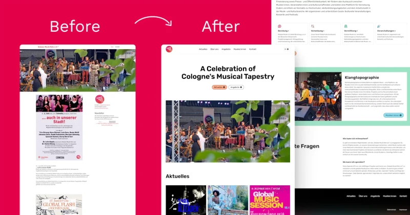
Case Study: Designing An Inclusive & Accessible Platform for Musicians
Introduction I redesigned the website for Globale Musik Köln e.V. to improve usability and accessibility. Here's how I tackled its challenges, refined the user experience, and what I learned! You can visit the website from here. My Design Mission The original site had issues that made it hard for users to understand the organisation's purpose, see which musicians they support, find available …
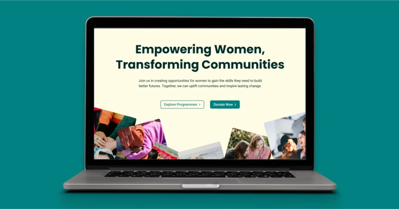
Case Study: Designed and Built a Website for an Empowering Women Community
Creating a website for a women’s empowerment community was an exciting opportunity to apply thoughtful design and development practices. I created a visually appealing yet practical platform that aligns with the brand’s values of kindness and inclusivity. While the project didn’t go live, the process was a valuable learning experience that I am proud to share 🙌 You can see the whole homepage …
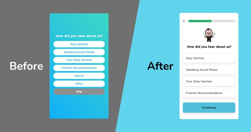
Case Study: Redesigning Seedlang App for Accessibility and User-Friendliness
As a UI/UX designer passionate about creating inclusive and intuitive experiences, I collaborated with Seedlang, a German learning app, to improve their registration process and home screen. This project was an opportunity to merge accessibility best practices with user-centred enhancements, which resulted in a design that supports all learners (including myself as a power user of Seedlang 😚) in …
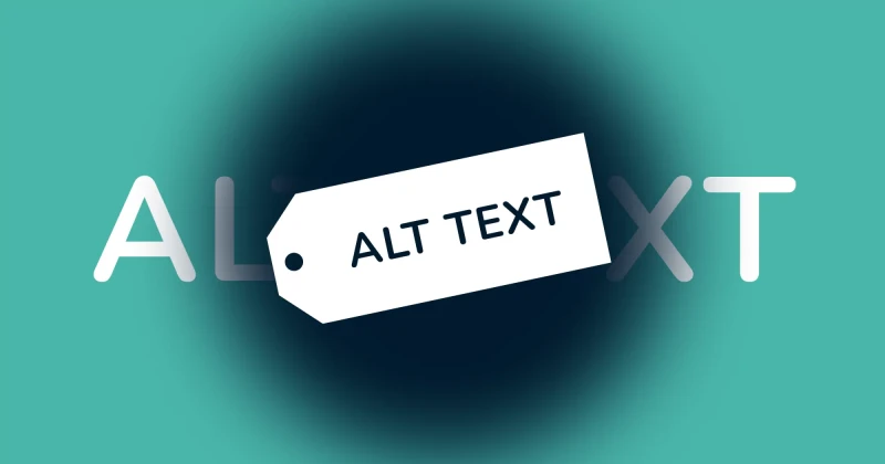
How Alt Text Makes Your Website Better for Everyone
“Alt text is just the text that shows up when an image doesn’t load, right?” That's what I thought when I was a software engineer. Sometimes I’d throw in a file name as alt text, and other times I’d skip it entirely. What I didn’t realise back then was that alt text is not optional, it’s essential. By the end of this article, you’ll know why alt text is so important, how to write it effectively, …
Is your website easy to navigate? How to properly structure your website 🛠️
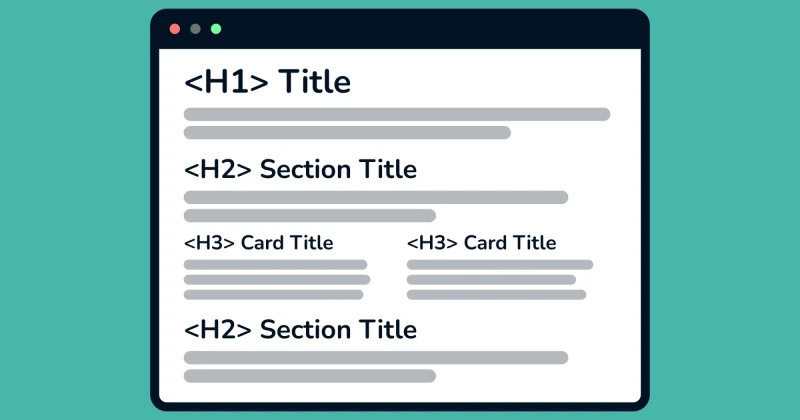
What are headings? Aren’t they just big, bold titles? That’s what I used to think, too. But headings are much more than that. Headings are hierarchical elements that indicate the importance and relationship between different sections of content. They are essential for both sighted and visually impaired users. Why having a proper heading structure matters 🤔 Sighted users understand website …
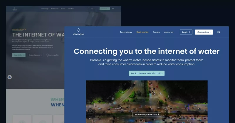
Improving Accessibility & UX on Droople’s Website! 💧
👩🏻🔬 Accessibility Insights from My Review While reviewing Droople’s website, I identified 23 accessibility and UI/UX issues on the homepage. Of these, 10 could be fixed with design changes, 12 required programming fixes, and 1 involved content editing. Let’s explore how I approached these issues and improved the design! ✅ How I Solved Accessibility and UX Issues 1. Colour Contrast Many text …
Make Your Website Easy to Read for Everyone (Why Colour Contrast Matters)
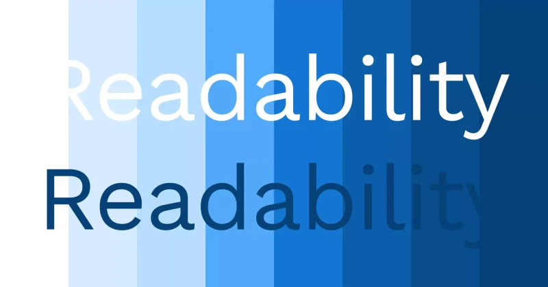
Have you ever used white text on a pastel background because it looked cute? You’re not alone—I’ve done it too 🥹 By the end of this blog, you’ll understand why that is a bad idea and how to maintain a beautiful, on-brand design without compromising accessibility. Why Low Contrast is a Problem For people with low vision or colour blindness, low-contrast text can be nearly impossible to read. The …
Finding Balance Between Fun, Joy, and Seriousness
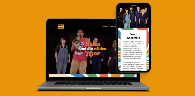
Designing the Sanat Ensemble website was both a rewarding and challenging experience. The task was to capture the vibrant energy of the 70s whilst honouring Turkish people and other communities who fought for equal rights. I also wanted the design to reflect the joy and lively spirit of their music and performances. Here’s a breakdown of the key struggles I encountered and how I overcame them! 1. …
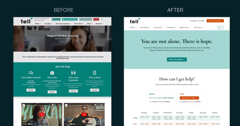
Making TELL Japan Website Accessible and Decluttered 🧹
👩🏻🔬 Accessibility Testing Insights During my review of the TELL Japan website, I identified 17 accessibility and UI/UX issues. While 7 of these issues required coding changes, I addressed the other 10 through design improvements. Here's how I tackled them. ✅ How I Solved Accessibility and UX Issues 1. Low Colour Contrast on Buttons and Text: I improved the colour contrast of text and essential …